
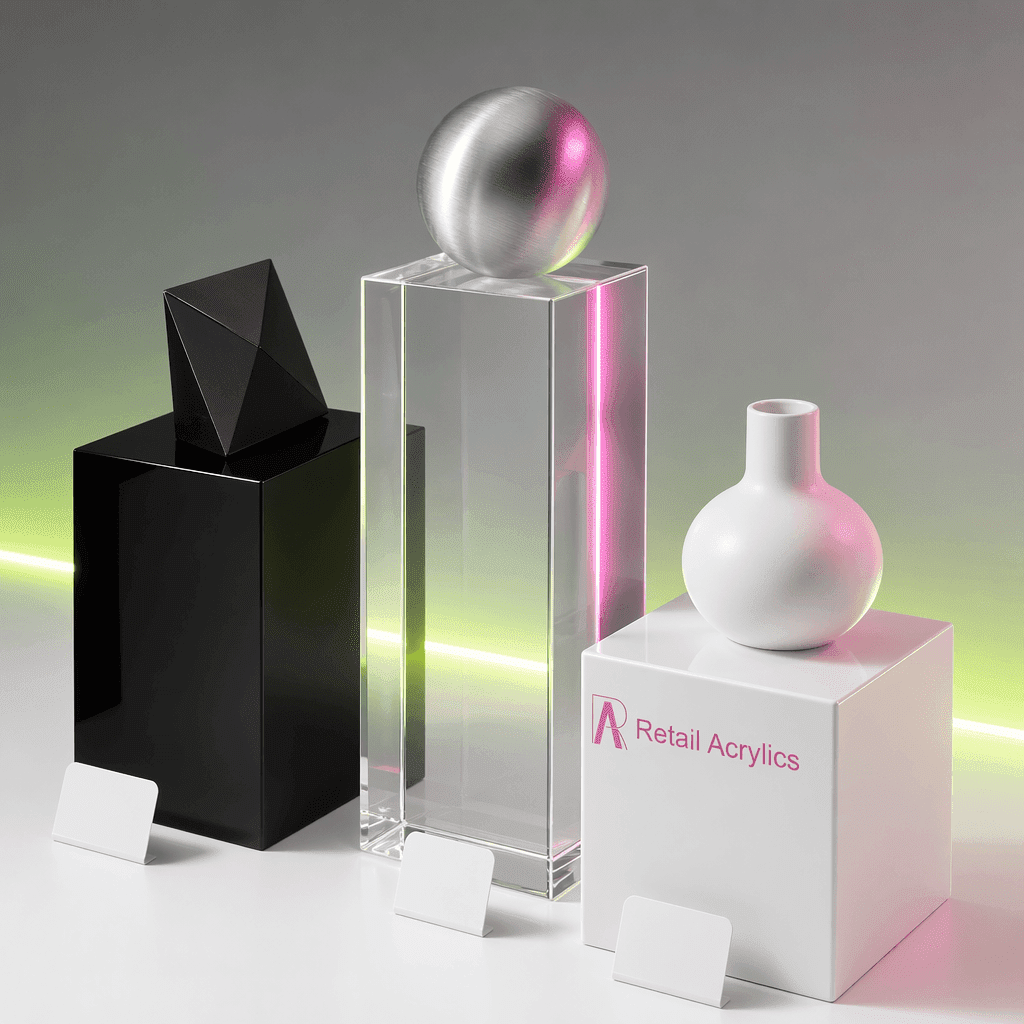
Walk into any well-designed retail space and you will notice something almost immediately, even if you cannot quite put your finger on it. The products on display seem to belong exactly where they are. They look premium, considered, and worth your attention. More often than not, the unsung hero behind that effect is the display pedestal sitting beneath them.
The colour of a display base is rarely an afterthought in professional retail and exhibition environments, yet many buyers treat it as one. Choosing the wrong base colour can undermine an otherwise excellent product presentation, while the right choice can elevate perceived value without a single word being said. Here is what you need to know before making that decision.
Why Colour Psychology Matters in Display
Colour communicates before language does. When a customer approaches a display, their brain processes the visual context of the scene in fractions of a second. That context includes the base the product sits on.
Research in consumer psychology consistently shows that the surrounding environment influences how we judge an object's quality, rarity, and price point. A product placed on a stark white pedestal reads differently from the same product on a gloss black base. Neither is inherently better, but each sends a distinct signal.
In display design, the base colour functions as a visual frame. Just as the matting around a piece of art influences how you perceive the artwork itself, the pedestal sets the stage for everything above it.
White Pedestals: Clean, Contemporary, and Versatile
White is the default choice for many retail and gallery environments, and for good reason. A white acrylic pedestal creates a neutral, light-reflecting surface that draws the eye upward toward the product rather than competing with it.
This works particularly well for:
- Colourful or multi-toned products that need breathing room
- Cosmetics and skincare displays where cleanliness is part of the brand promise
- Gallery and museum settings where minimalism is the standard
- Wedding and event displays where the overall aesthetic tends toward the light and airy
One consideration with white is that it can read as clinical in the wrong setting. If your retail environment leans warm or rustic, a white base may feel out of place. Context is everything.
Our white acrylic display pedestals are available in heights from 30cm to 120cm, meaning you can create tiered or single-feature displays with the same clean visual language throughout.
Black Pedestals: Authority, Luxury, and Drama
Black bases do something white cannot. They create contrast that makes a product appear almost suspended in space, particularly under focused lighting. That contrast registers as premium in the consumer brain.
Jewellery retailers have known this for decades. A ring or watch placed on a black surface seems to glow, catching the light in a way that feels deliberate and significant. The same principle applies to:
- Electronics and tech products where sleek and modern is the desired read
- Sports memorabilia and collectibles where the display itself signals importance
- Luxury goods of any category where the environment must justify the price
- Photography and media displays where high contrast is visually compelling
Black also has a practical advantage: it tends to hide scuffs and surface marks better than lighter colours in high-traffic environments, making it a sensible long-term investment for busy retail spaces.
Clear Acrylic Pedestals: Letting the Product Lead
Sometimes the most powerful choice is near-invisibility. A clear acrylic pedestal places the product in space without any colour conversation happening below it. The base disappears, and the object becomes the sole visual subject.
This approach works well when:
- The product itself has a complex or detailed base that you want customers to see fully
- The surrounding display environment is already busy and you need to reduce visual noise
- The retail setting uses a specific floor finish that you want to remain visible as part of the overall design
- Minimalism is a core part of the brand identity
Clear pedestals also photograph exceptionally well, which matters if your products are being documented for e-commerce or press purposes.
Matching Base Colour to Your Brand Identity
Beyond the product itself, the pedestal colour should align with your wider brand palette. Consistency across a display environment builds trust and recognition. If your brand uses strong primary colours, a neutral base (white, black, or clear) tends to be the safest complement. If your brand is monochromatic, you have more freedom to introduce texture or contrast through the base.
For businesses that operate across multiple venues or events, consistency in pedestal colour becomes a brand asset in its own right. Customers begin to associate the display format with your products, which reinforces recognition over time.
This is particularly relevant for exhibition and event use, where competitors are often displaying products side by side. A cohesive, considered display setup communicates professionalism before anyone reads a single label or price tag.
Height and Colour Working Together
Colour selection does not exist in isolation from height. A 30cm white pedestal and a 120cm white pedestal create very different visual experiences, even with identical products on top.
Taller pedestals command attention from a distance. Paired with a dark colour, they become focal points. Shorter pedestals grouped together in lighter colours create a sense of abundance and accessibility. Thinking about height alongside colour gives you a much more complete picture of the final display effect.
Our pedestals range from 30cm to 120cm in height, all available in a range of colours, giving you genuine flexibility to build displays that work for your specific environment rather than compromising with a one-size approach.
Making the Right Choice for Your Space
There is no universally correct answer to pedestal colour selection. The right choice depends on your product, your brand, your retail environment, and your customer. What works in a high-end jewellery boutique will not necessarily work in a busy trade exhibition, and vice versa.
What does remain constant is this: the base you choose is never neutral in its effect, even when it is neutral in colour. It is always communicating something to your customer. The question is whether that message is intentional or accidental.
If you are working through a display project and want to see the range of options available, browse our full selection of acrylic pedestals and plinths. All items are in stock, manufactured in the UK, and available with free delivery on orders over £150. If you have a specific project in mind, you can reach our team directly at hello@retailacrylics.co.uk or by calling 02920360118.